이전 글 : 2022.06.09 - [react-chatbot-kit] 챗봇 구현하기 - 2
챗봇 스타일링하기
🌮 기본 구조 파악하기
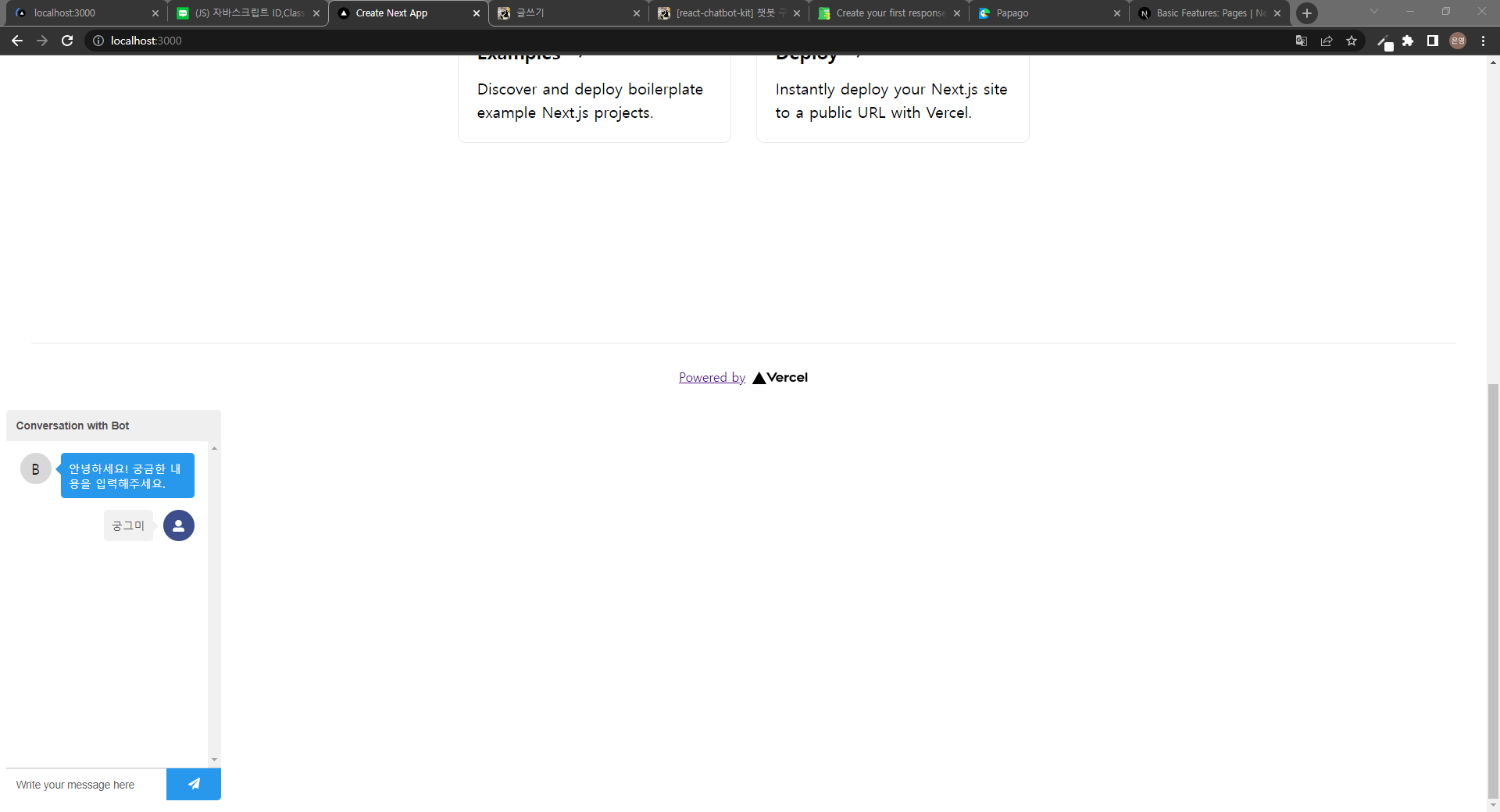
초기 상태의 챗봇은 요렇게 생겼다. 스타일해줄 부분을 정리해보면 다음과 같다.
- 챗봇 화면 자체 위치
- 헤더
- 챗봇 프로필 아이콘
- 챗봇 메세지
- 사용자 프로필 아이콘
- 사용자 메세지
- 메세지 입력 창
- 보내기 버튼
처음부터 뜯어보면서 차근차근 스타일링해보자!
🌮 챗봇 화면 자체 위치 조정
챗봇 화면 위치의 경우 거의 화면 오른쪽 하단에 고정된 것을 많이 볼 수 있다. 나도 그렇게 해 줄 예정이다! 공식문서의 Customizing CSS 파트를 참고하면 스타일링할 클래스들의 이름을 쉽게 찾을 수 있다. styles 폴더에 chatbot.css 파일을 추가해 복사 붙여 넣기 해주자.
/* styles/chatbot.css */
.react-chatbot-kit-chat-container {
}

.react-chatbot-kit-chat-inner-container {
}

.react-chatbot-kit-chat-header {
}

.react-chatbot-kit-chat-input-container {
}

.react-chatbot-kit-chat-message-container {
}

.react-chatbot-kit-chat-input {
}

.react-chatbot-kit-chat-input-form {
}

.react-chatbot-kit-chat-input::placeholder {
}

.react-chatbot-kit-chat-btn-send {
}

.react-chatbot-kit-chat-btn-send-icon {
}

.react-chatbot-kit-chat-bot-message-container {
}

.react-chatbot-kit-chat-bot-avatar-container {
}

.react-chatbot-kit-chat-bot-avatar-icon {
}

.react-chatbot-kit-chat-bot-avatar-letter {
}

.react-chatbot-kit-chat-bot-message {
}

.react-chatbot-kit-chat-bot-message-arrow {
}

.react-chatbot-kit-chat-bot-loading-icon-container {
}

.chatbot-loader-container {
}

#chatbot-loader #chatbot-loader-dot1 {
}

#chatbot-loader #chatbot-loader-dot2 {
}

#chatbot-loader #chatbot-loader-dot3 {
}

.react-chatbot-kit-error {
}

.react-chatbot-kit-error-container {
}

.react-chatbot-kit-error-header {
}

.react-chatbot-kit-error-docs {
}
새로운 css 파일을 만들었으니 임포트를 해주자. 새로 만든 chatbot.css를 기존 챗봇 스타일 css인 react-chatbot-kit/build/main.css 밑에 임포트 해줘야 우리가 정의한 스타일이 적용된다.(chatbot.css를 위에 해줘도 되지만 모든 라인마다 !important를 붙여줘야 하는 귀찮은 일이 발생한다.)
// pages/_app.tsx
import "../styles/globals.css";
import "react-chatbot-kit/build/main.css";
import "../styles/chatbot.css";
위치를 화면 오른쪽 하단에 고정시키고 그림자를 넣는 등 스타일링을 해준다.
/* styles/chatbot.css */
.react-chatbot-kit-chat-container {
  position: fixed;
  right: 30px;
  bottom: 25px;
  width: 370px;
  height: 80%;
  min-height: 520px;
  max-height: 680px;
  overflow: hidden;
  border-radius: 25px;
  box-shadow: rgb(0 0 0 / 30%) 0px 12px 60px 5px;
}
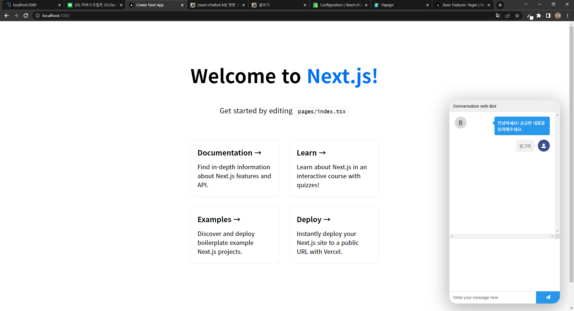
🌮 헤더 스타일링
공식문서의 In depth 카테고리 중 Configuration의 customComponents 파트를 살펴보면 헤더, 프로필 아이콘, 메세지를 따로 컴포넌트로 만들어 커스텀해줄 수 있다고 나와있다. 요걸 참고해 헤더 컴포넌트를 따로 만들어 적용시켜보자.
일단 헤더에 이전 버튼과 닫기 버튼을 넣어주기 위해 아이콘 라이브러리를 설치해주자! 아이콘의 경우 remixicon 라이브러리를 아주 유용하게 사용하고 있다.
npm install remixicon
// pages/_app.tsx
import "remixicon/fonts/remixicon.css";
components 폴더를 만들어 하위에 Header.tsx 파일을 생성해주고 원하는 대로 스타일링을 해준다. 뭔가 있어 보이게 그라데이션도 넣어준당.
// components/Header.tsx
import styled from "styled-components";

const HeaderContainer = styled.div`
  background: rgb(92, 130, 255);
  background: linear-gradient(
    90deg,
    rgba(157, 92, 255, 1) 0%,
    rgba(92, 130, 255, 1) 100%
  );
  width: 100%;
  display: flex;
  justify-content: space-between;
  align-items: center;
  padding: 1.4rem;

  .ri-close-line,
  .ri-arrow-left-s-line {
    font-size: 1.5rem;
    color: #ffffff;
  }
`;

function Header() {
  return (
    <HeaderContainer>
      <i className="ri-arrow-left-s-line" />
      <i className="ri-close-line" />
    </HeaderContainer>
  );
}

export default Header;
파일을 만들었으면 config.js 파일에 임포트 해 헤더 컴포넌트를 전달해주자.
// bot/config.js
import { createChatBotMessage } from "react-chatbot-kit";

import Header from "../components/Header.tsx";

const config = {
  initialMessages: [
    createChatBotMessage(
      "안녕하세요! 궁금한 내용을 입력해주세요."
    ),
  ],
  customComponents: {
    // Replaces the default header
    header: () => <Header />,
    // Replaces the default bot avatar
    // botAvatar: (props) => <BotAvatar {...props} />,
    // Replaces the default bot chat message container
    // botChatMessage: (props) => <BotChatMessage {...props} />,
    // Replaces the default user icon
    // userAvatar: (props) => <UserAvatar {...props} />,
    // Replaces the default user chat message
    // userChatMessage: (props) => <UserChatMessage {...props} />,
  },
};

export default config;
이렇게 해주면 다음과 같은 그라데이션 헤더를 만들 수 있따!
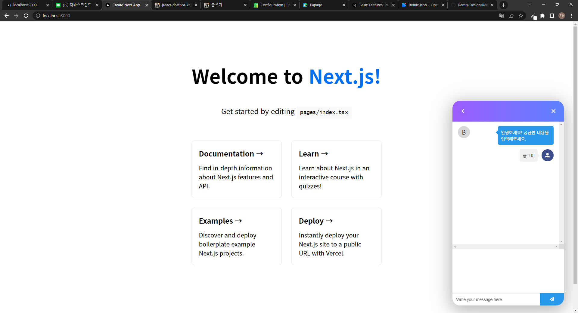
🌮 챗봇 프로필 아이콘, 사용자 프로필 아이콘 스타일링
딱히 프로필 아바타.. 아이콘.. 필요 없을 것 같아서 아무것도 넣어주지 않을 것이다.
// bot/config.js
import { createChatBotMessage } from "react-chatbot-kit";

import Header from "../components/Header.tsx";

const config = {
  initialMessages: [
    createChatBotMessage(
      "안녕하세요! 궁금한 내용을 입력해주세요."
    ),
  ],
  customComponents: {
    // Replaces the default header
    header: () => <Header />,
    // Replaces the default bot avatar
    botAvatar: (props) => <div {...props} />,
    // Replaces the default bot chat message container
    // botChatMessage: (props) => <BotChatMessage {...props} />,
    // Replaces the default user icon
    userAvatar: (props) => <div {...props} />,
    // Replaces the default user chat message
    // userChatMessage: (props) => <UserChatMessage {...props} />,
  },
};

export default config;

🌮 챗봇 메세지, 사용자 메세지 스타일링
챗봇 메세지 스타일과 사용자 메세지 스타일의 공통점이 매우 많으므로 하나의 컴포넌트로 정의해주고 다른 부분만 props를 이용해 다르게 처리해주자. bot이라는 속성을 만들어 챗봇의 메세지인 경우 bot 속성을 true로 지정해주고 사용자의 메세지인 경우 bot 속성을 false로 지정해 스타일을 달리 해주는 원리이다.
그러기 위해서 먼저 첫 번째, components 폴더에 ChatMessage.tsx 컴포넌트를 만든다. ChatMessage 컴포넌트는 bot이라는 속성을 받아 만약 bot이 true일 경우 ChatMessageContainer의 isBot 속성에 true를 넘겨주고 만약 bot이 false인 경우 ChatMessageContainer의 isBot 속성에 false를 넘겨준다.
// components/ChatMessage.tsx
import styled from "styled-components";

interface Bot {
  isBot?: boolean;
}

const ChatMessageContainer = styled.div<Bot>`
  max-width: 85%;
  width: fit-content;
  display: flex;
  justify-content: center;
  background-color: ${(props) => (props.isBot ? "#f2f2f2" : "#5c82ff")};
  border-radius: ${(props) =>
    props.isBot ? "20px 20px 20px 5px" : "20px 20px 5px 20px"};
  margin-left: 0.4rem;
  color: ${(props) => (props.isBot ? "#3d4f6e" : "#ffffff")};
  padding: ${(props) => (props.isBot ? "0.8rem 1.2rem" : "0.7rem 1.1rem")};
  font-weight: ${(props) => (props.isBot ? "500" : "400")};
  font-size: 0.97rem;
  line-height: 1.3rem;
  word-break: keep-all;
`;

function ChatMessage({ message, bot }: any) {
  return <ChatMessageContainer isBot={bot}>{message}</ChatMessageContainer>;
}

export default ChatMessage;
만들어준 메세지 컴포넌트를 실제로 적용시켜준다.
// bot/config.js
import { createChatBotMessage } from "react-chatbot-kit";

import Header from "../components/Header.tsx";
import ChatMessage from "../components/ChatMessage.tsx";

const config = {
  initialMessages: [
    createChatBotMessage(
      "안녕하세요! 궁금한 내용을 입력해주세요."
    ),
  ],
  customComponents: {
    // Replaces the default header
    header: () => <Header />,
    // Replaces the default bot avatar
    botAvatar: (props) => <div {...props} />,
    // Replaces the default bot chat message container
    botChatMessage: (props) => <ChatMessage {...props} bot />,
    // Replaces the default user icon
    userAvatar: (props) => <div {...props} />,
    // Replaces the default user chat message
    userChatMessage: (props) => <ChatMessage {...props} />,
  },
};

export default config;
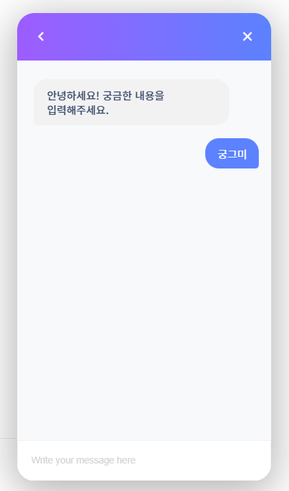
메세지 컴포넌트를 적용시킨 화면은 다음과 같다!
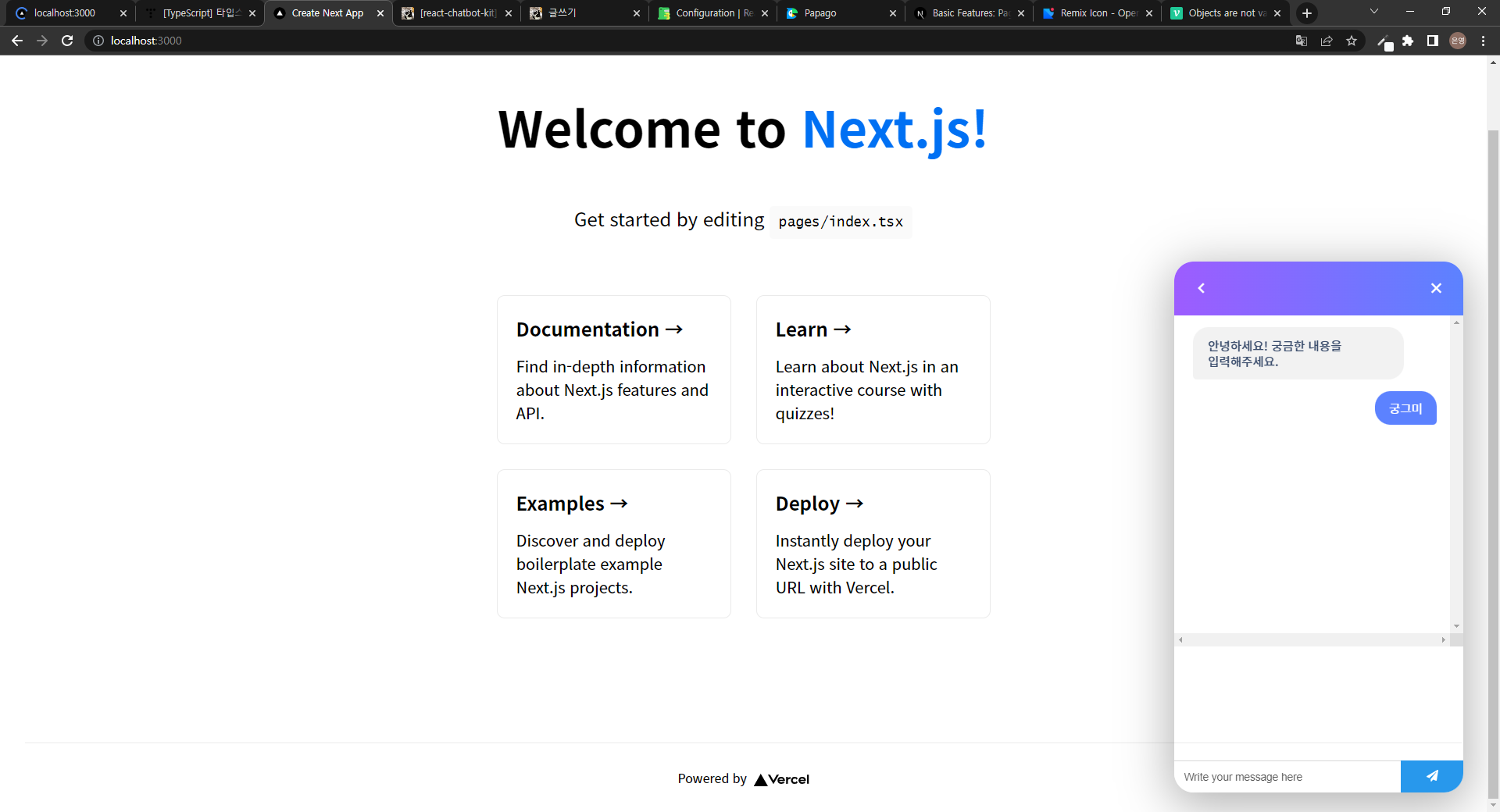
🌮 나머지 CSS
메세지 입력 창이나 보내기 버튼, 채팅 배경화면 등은 간단한 CSS 작업이당.
// styles/chatbot.css
.react-chatbot-kit-chat-container {
  position: fixed;
  right: 30px;
  bottom: 25px;
  width: 370px;
  height: 80%;
  min-height: 520px;
  max-height: 680px;
  overflow: hidden;
  border-radius: 25px;
  box-shadow: rgb(0 0 0 / 30%) 0px 12px 60px 5px;
}

.react-chatbot-kit-chat-inner-container {
  height: 100%;
  background-color: #f8f9fa;
}

.react-chatbot-kit-chat-input-container {
  padding: 0;
}

.react-chatbot-kit-chat-message-container {
  height: 560px;
  padding: 0.5rem 1.1rem;
  -ms-overflow-style: none;
  scrollbar-width: none;
}

.react-chatbot-kit-chat-message-container::-webkit-scrollbar {
  display: none;
}

.react-chatbot-kit-chat-input {
  border: none;
  border-radius: 20px;
  padding: 1.3rem 1.2rem;
  margin-right: 0.5rem;
  font-weight: 300;
}

.react-chatbot-kit-chat-input:focus-visible {
  outline: none;
}

.react-chatbot-kit-chat-input-form {
  background-color: #ffffff;
  border: 1.4px solid #f2f2f2;
}

.react-chatbot-kit-chat-input::placeholder {
  color: #d4d4d4;
  font-weight: 300;
}

.react-chatbot-kit-chat-btn-send {
  width: fit-content;
  height: fit-content;
  border-radius: 10px;
  padding: 0.8rem;
  background-color: transparent;
}

.react-chatbot-kit-chat-bot-message-container {
  align-items: flex-end;
  margin: 1.2rem 0;
}
🐱👤 참고 : https://fredrikoseberg.github.io/react-chatbot-kit-docs/docs/
'프로젝트 > Chatbot' 카테고리의 다른 글
| [react-chatbot-kit] 챗봇 구현하기 - 2 (0) | 2022.06.09 |
|---|---|
| [react-chatbot-kit] 챗봇 구현하기 - 1 (0) | 2022.06.07 |

